These guidelines define our identity and provide clear principles for presenting the St8 brand across all media.
Logo
The St8 logotype is a core brand asset and the foundation of all visual communication. It is designed to communicate our brand identity at every touchpoint. To protect its strength and recognition, the logotype must always be used as provided in the official master files- never redrawn, altered, stylised or visually enhanced.
Use the logotype consistently across all platforms and materials to preserve brand identity.
Minimum horizontal width of the logotype is 35px.
Logo
A clear protective space must surround the St8 logotype at all times. This ensures maximum legibility and visual impact, regardless of placement or background. No text, imagery or graphic elements may intrude into this zone.
Maintaining sufficient safe space allows the logo to stand confidently and reinforces the strength of the St8 identity.
Logo
The St8 logotype must never be modified or reconstructed in any way. Do not remove the dot, change its colour or position, rotate the mark, stretch or distort its proportions. The logotype may not be filled with colours, patterns or textures, nor outlined or enhanced with shadows or effects.
Never place the logotype on backgrounds that reduce contrast or legibility. Any misuse weakens brand recognition and is strictly forbidden across all communications.
Logo
When aligning the St8 logo always use the optical centre of the “St8” wordmark as the reference and not the full width including the dot. The dot must remain outside the centering calculation, otherwise the logo appears shifted to the left.
Logo
The St8 logotype must be placed in one of the approved positions as shown. These placement are designed to maximise visibility while preserving layout flexibility across different formats and screen ratios.
Do not position the logo arbitrarily. Consistent placement strengthens brand recall and visual coherence.
Logo.
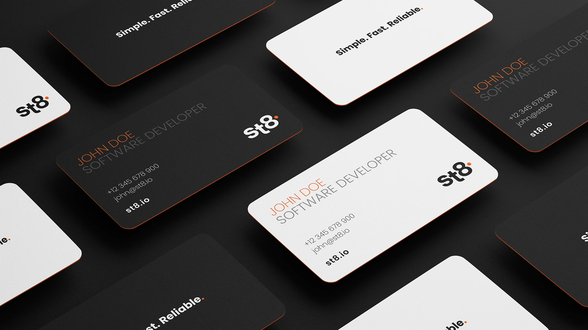
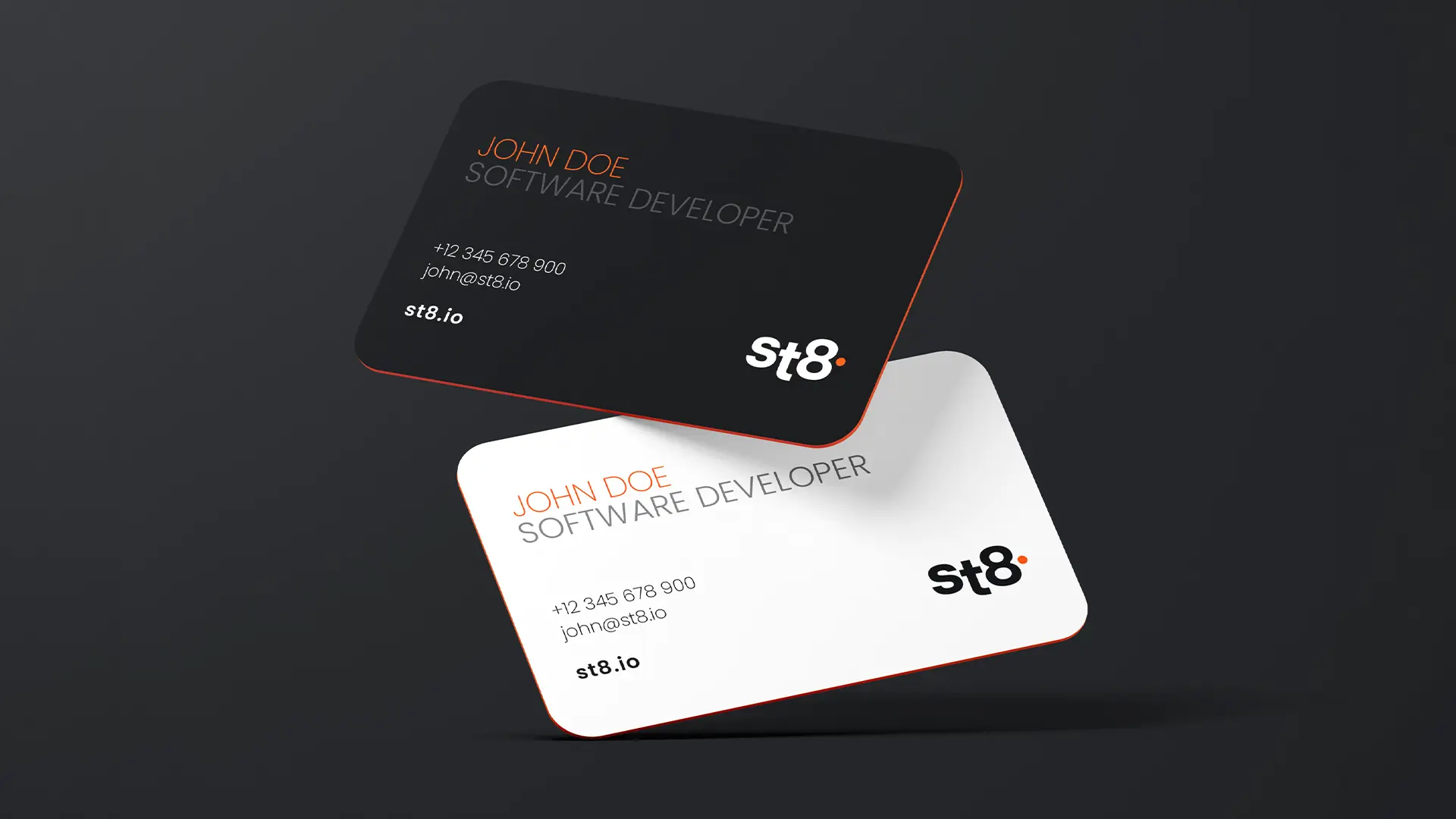
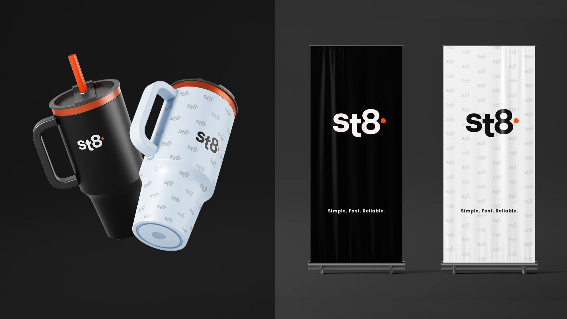
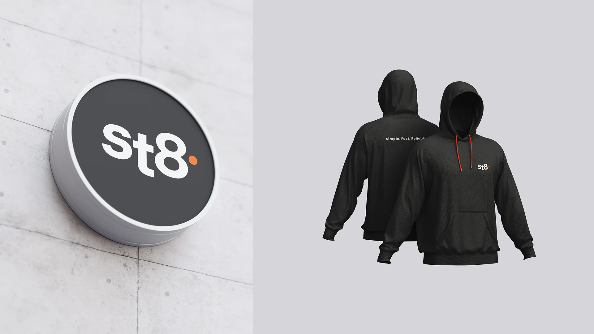
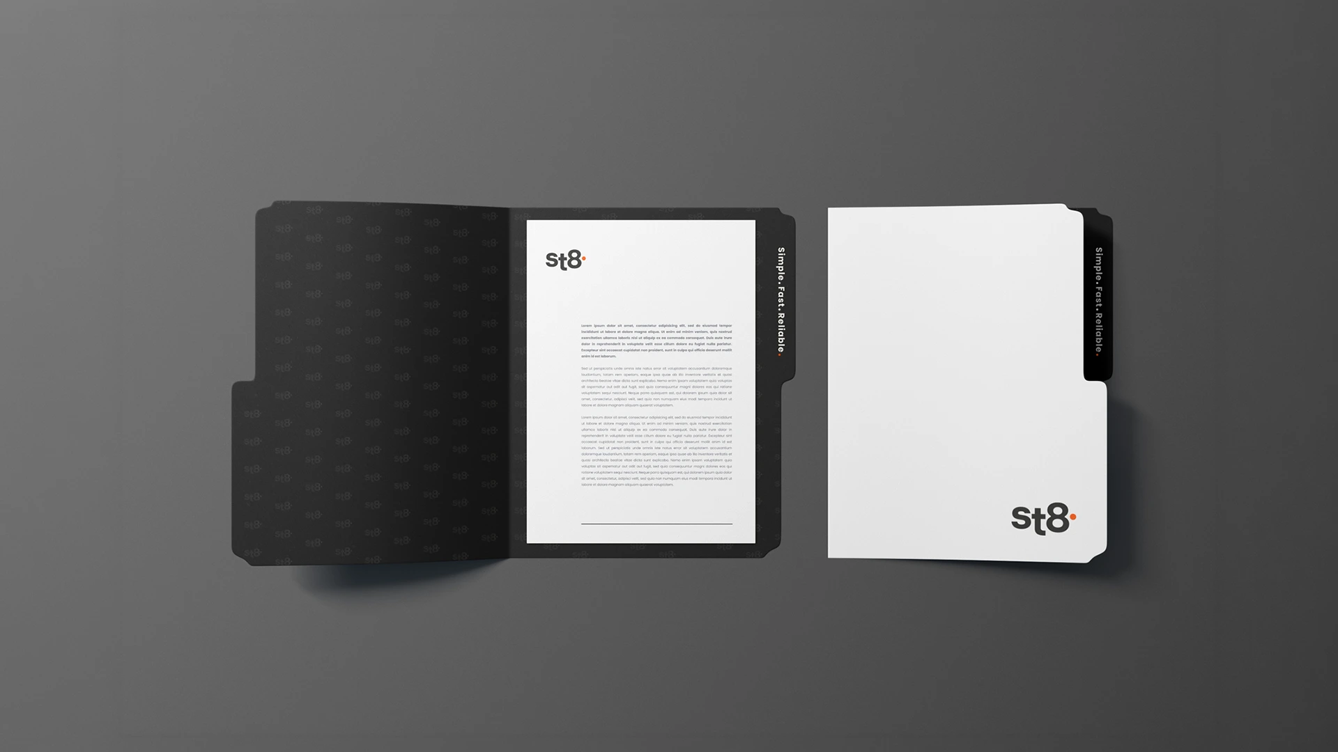
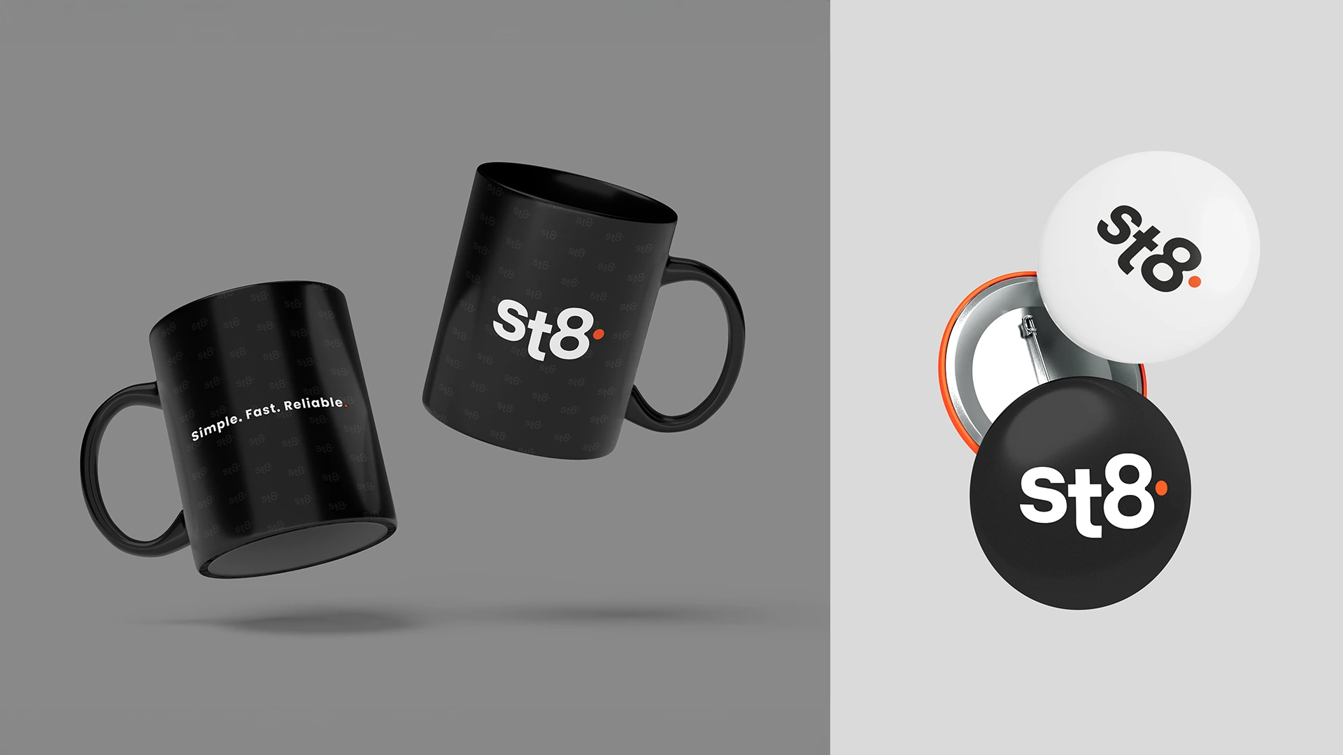
The St8 tagline – “Simple. Fast. Reliable.” – captures the brand promise in three sharp words. It must always be used exactly as written, with no changes to wording, order, punctuation, or added elements. It consistently reinforces the platform’s core values across all key communications.
In rare cases where a single-line horizontal layout is technically or compositionally impossible, the vertical stacked version may be used as a fallback: Simple. Fast. Reliable. This vertical version should only be used when the standard one-line horizontal really cannot be applied.
Logo
The St8 logo & tagline “Simple. Fast. Reliable.” create a single, cohesive brand lockup. The tagline must always use the Poppins font in the same weight as the logo. The two main versions are the stacked arrangement with the tagline centered directly below the logo (most common) and the horizontal version with the tagline positioned to the right and baselines aligned.
Alignment should be optical so that baselines match in the horizontal layout or centers align perfectly when stacked. Do not recolour the tagline separately, remove the full stops, rearrange the words, rotate, stretch or use any other font.
This lockup keeps the brand clean, consistent and instantly recognisable.


Colours
The St8 logo may be used in reversed or single-colour versions when design or production conditions require it.
These versions are intended for dark backgrounds, monochrome applications or restricted printed environments.
Colours
The primary St8 colours palette is built around black, white and St8 orange. These colours form the foundations of our visual language and must dominate all branded materials.
Use black as the base, white for clarity and structure, and orange as a strategic accent to highlight key elements.
Recommended black for most printing is C60 M40 Y40 K100- deepest, most saturated black.
C0 M0 Y0 K100 for very small text, thin lines <0.4mm or single-colour black printing.
Colours
Secondary colours support and extend the primary palette, adding flexibility while preserving the St8 identity. They are designed for functional use- charts, diagrams, infographics and data visualisations- where clear distinction between elements is required.
These colours must always remain subordinate to the core black-white- orange primary palette and should never dominate or redefine the visual character of the brand.


Typography
Poppins is the official St8 typeface. Its clean geometry and modern proportions reflect the technological precision and accessibility of our platform.
Use the full font family to create clear hierarchy, balanced layouts and consistent visual rhythm across all communications.
Typography
A disciplined typographic system ensures clarity and consistency. Headlines use Poppins Bold with tightened tracking for impact.
Sub-headlines rely on Poppins Medium, while body copy is set in Poppins Regular for optimal readability.
Respect the defined hierarchy to maintain a strong and recognizable brand voice.